Thursday, December 19, 2013
Jimi Hendrix.
This is "Jimi Hendrix" by Denny Dent, and painter from Oakland, Ca. I like this piece for many reasons. One reason is that I personally enjoy a multitude of music by Jimi Hendrix and his band The Jimi Hendrix Experience. I also like the strong, bright colors in this composition because I feel that these bright colors truthfully express Jimi's mind and spirit as a person, and as a musical artist.
Tuesday, December 10, 2013
Media Choice
Out of all the media we have used in our art class, my favorite media, and the type of media I would like to use during open studio was and is the Cray Pas. I enjoyed using the Cray Pas because they allowed me to mold and blend colors in a way that I think is much easier than with paints. I also liked to use the Cray Pas because they gave me the ability to make a mistake but still be able to erase it or draw over it, without the mistake being permanently seen.
"Bob Marley"
Tuesday, November 26, 2013
Reflection Blog
In my blog posts, I find many different reoccuring elements of art in almost all of the picures or paintings from my posts. One of the most occuring elements is strong contrast. Strong bold contrasts in my mind exlpain me as a person. I do not think of myself to be a person who fades back in the crowd, who doesnt like to stand out and be thereself no matter what others may think. I think that this is why I am drawn to pictures and paintings with strong contrast. Also, I find that most of my post feature a painting that is not abstracted. It portraits a person or object in its most real, recognizable form. I think I am drawn to these compositions because in my life I try to be straight forward with people; no lies, no games, only honesty. I dont want any jaded views from those who give them, and I dont want to be lied to.
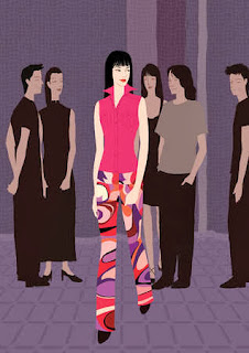
I think this picture perfectly describes what i have just said about myself. This may no represent me physically, but I feel in terms of this person breaking away from the crowd and being themselves with everyone, it creates the contrasting personality I feel that I have.
I think this picture perfectly describes what i have just said about myself. This may no represent me physically, but I feel in terms of this person breaking away from the crowd and being themselves with everyone, it creates the contrasting personality I feel that I have.
Thursday, October 10, 2013
Symmetrical, Asymmetrical, and Radial Balance
This Chinese mask shows examples of symmetrical balance. You can see this balance in shapes, and implied shapes. Symmetrical balance can also be seen in the colors used on this mask.
"Starry Night" by Van Gogh displays asymmetrical balance. This can be seen in the sky and also in the small town or village depicted in the painting. All stars in the sky are in different places, with no mirror effect. The same can be said with the small town, no mirrored houses or buildings, so no symmetrical balance.
This painting: "The Last Supper" originally by Leonardo DiVinci displays radial balance. All of the men in the painting go away from or radiate from the man in the middle, (who I won't name to remain politically correct). This is a different way to show radial balance, and most are in circular shape, with different circular and triangular shapes coming from the middle, but with all the men surrounding the man in the middle this does in fact create radial balance
Thursday, October 3, 2013
Mask Patterns
This is a Chinese mask. In Chinese mask making, they almost always use a symmetrical pattern. Symmetrical patterns are when one half of a composition has a mirror image, split down the middle. The pattern is shown in cross-hatching lines, implied shapes and lines, and in small details in areas around the eyes and mouth.
Thursday, September 26, 2013
Portrait Blog
"The Blue Boy" by Thomas Gainsborough, depicts who is believed to be Jonathan Buttall, but this has not been proven. I like this peice because though just a portrait of a young boy, I believe that it shows the separation from the wealthey from the rest of society in 18th century Europe. Separating the boy from the dark and dreary background and placing him up front in a eye catching blue suit, shows his distinction from his surroundings.
Thursday, September 12, 2013
Carlos Amorales
This piece "Dark Cloud" by Carlos Amorales, is composed by tens of thousands of black paper moths, to create powerful movement throughout the gallery where it is placed. I like this because of its fooling extravagance. This makes you think of a complex placement for each moth, but in reality, they are just paper moths simply placed on a wall, but the size of the total composition creates a feeling of great complexity.
Tuesday, September 3, 2013
Line Work Assignment

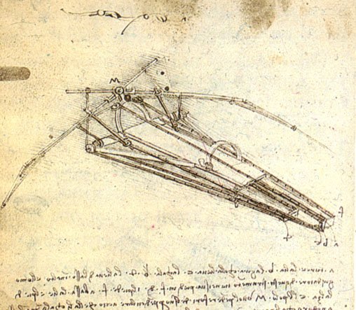
This is a sketch called "Flying Machine" by Leonardo da Vinci. This is a good example of precise line work for detail and hatching. This sketch also exhibits Leonardo's use of cross hatching for the use of shading. I personally like da Vinci because i feel that he was hundreds of years ahead of is time when it came to his ideas, and also because he used is art in a large way to give the human race new information on the human anatomy, and many more "futuristic" ideas.
Subscribe to:
Comments (Atom)


